This tab shows the charts which relate to a range of dates selected. The following chart shows 12 months of data from 3/2023 to 2/2024.
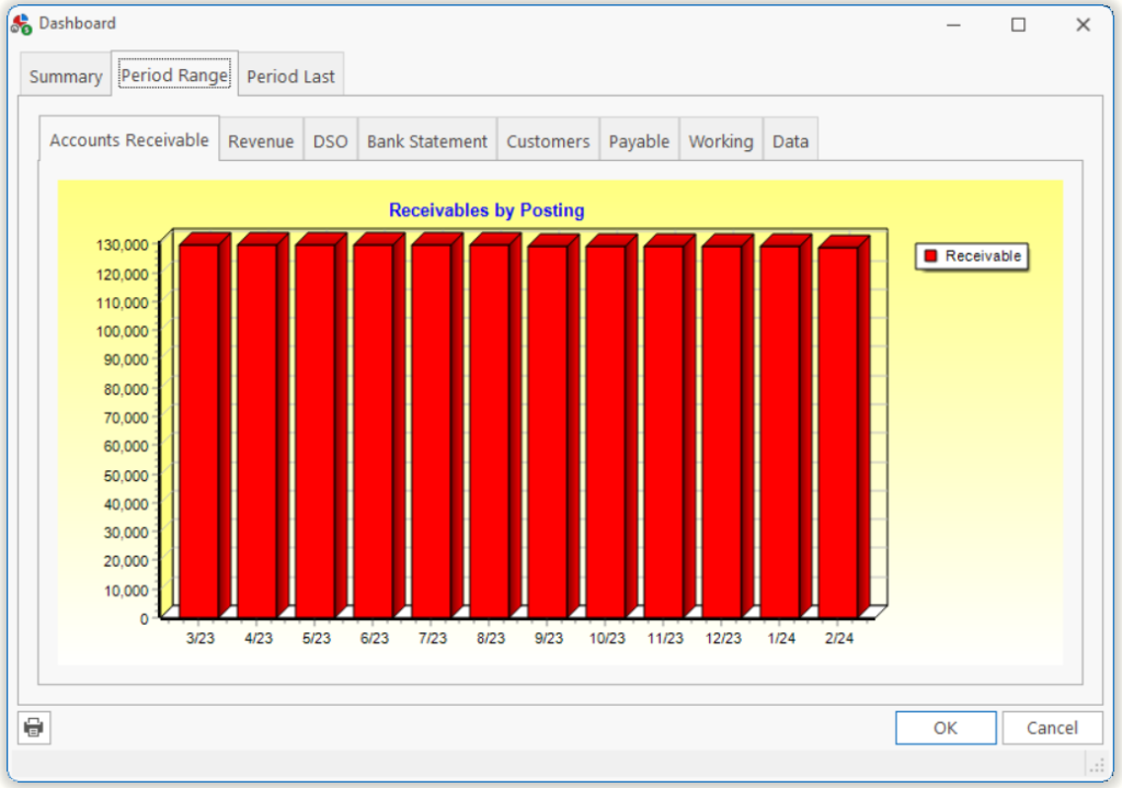
| Accts Receivable | This chart shows a bar representing the Accounts Receivable balance at the end of each period.
Note: You can see the same information by printing an Aged by Total report using the Period Ending date. |
| Revenue | This graph shows the following data and the relationship between each, including Gross Revenue, Nonallowed amounts, Payments, Adjustments and Costs.
Note: You can see the same information by printing any Revenue report using the Period Range dates. |
| DSO | This chart shows a bar representing the DSO of each period.
Note: The DOS is calculated by taking the Accounts Receivable amount and dividing by the Average Daily Sales. The Average Daily Sales (ADS) is calculated on the Revenue for the prior three periods divided by the number of days in these periods. These average tempers your ADS over periods where Revenue fluctuates significantly. |
| Bank Statement | This chart shows a bar representing the Bank Balance of each period.
Note: You can see this information in detail by printing a Bank Reconciliation report. The Bank Balance is calculated on the net amount of Deposits/Withdrawals from all bank accounts as represented in the Register Edit form. |
| Customers | This chart shows a bar representing the total number of customers with red indicating active and blue indicating inactive customers.
Note: You can see this information by printing a Customer List and filtering on Active/Inactive customers. |
| Payable | This chart shows a bar representing the Accounts Payable balance at the end of each period.
Note: You can see this same information by printing an Aged Payables report using the Period Ending date. |
| Working | This chart shows a representation of your Total Receivables vs. Eligible Receivables.
Note: Eligible Receivables include receivables less than 120 days old and to a Payor other than Self. |
| Data | This grid shows you the data used to create the graphs and charts on the Period Range tab. If you’d like to export the data and analyze it in your spreadsheet, right-click on the grid and choose Export. |
Tell us what you think.
You must be logged in to post a comment.